At the time of writing, Salesforce does not provide a navigation data type for its lightning-datatable component. In this post, I am going to give a detailed explanation of how to create a custom navigation type for the data table, thereby extending its functionality.
The steps to create and use the custom navigation type are as follows:
- Create a custom navigation component.
- Create a custom datatable component that extends the standard lightning datatable.
- Create a component that utilises the custom datatable.
Create a Custom Navigation Component
Create a new Lightning Web Component called customNavigation. The properties we will need in this component are the recordId and label:
import { LightningElement, api } from 'lwc';
import { NavigationMixin } from 'lightning/navigation';

export default class CustomNavigation extends NavigationMixin(LightningElement) {
  @api recordId;
  @api label;

  navigateToRecordViewPage = () => {
    this[NavigationMixin.Navigate]({
      type: 'standard__recordPage',
      attributes: {
        recordId: this.recordId,
        actionName: 'view',
      }
    });
  }
}
We will obtain the recordId and label from our datatable component. NavigationMixin is a module provided by LWC for navigating to different page types, like records, list views, custom tabs, objects etc. NavigationMixin provides an API called NavigationMixin.Navigate to implement navigation features. You can learn more about this module from the documentation provided by Salesforce.
Next, add an anchor tag to the HTML template file:
<template>
  <a onclick={navigateToRecordViewPage}>{label}</a>
</template>
This invokes the navigateToRecordViewPage via the onclick event attribute.
Create a Custom Datatable Component
Create a new Lightning Web Component called customDatatable that extends the standard datatable:
import LightningDatatable from 'lightning/datatable';
import customNavigationTemplate from './customNavigationTemplate.html';

export default class CustomDatatable extends LightningDatatable {
  static customTypes = {
    navigation: {
      template: customNavigationTemplate,
      typeAttributes: ['label', 'rowId'],
    }
  };
}
Here we are providing the template and attributes as part of the navigation property to the customTypes object. When the custom data table is constructed, it will construct the component using the template. To use the navigation type, we just need to define type: 'navigation' in our columns definition. It is important to note that multiple custom types can be defined within customTypes.
Next, create a customNavigationType template file in the customDatatable folder. This template will be used to create the custom type when the data table renders:
<template>
  <c-custom-navigation
    label={typeAttributes.label}
    record-id={typeAttributes.rowId}>
  </c-custom-navigation>
</template>
It is in the customNavigationType HTML template file where we use our custom navigation component. We pass the label and rowId from the typeAttributes of the custom datatable.
Create a Component That Utilises The Custom Datatable
Create a new Lightning Web Component called customNavDemo:
import { LightningElement, wire } from 'lwc';
import { NavigationMixin } from 'lightning/navigation';
import { ShowToastEvent } from 'lightning/platformShowToastEvent';

import getCases from '@salesforce/apex/CasesController.getCases';

import CASE_NUMBER from '@salesforce/schema/Case.CaseNumber';
import PRIORITY from '@salesforce/schema/Case.Priority';
import SUBJECT from '@salesforce/schema/Case.Subject';
import STATUS from '@salesforce/schema/Case.Status';

export default class CustomNavDemo extends NavigationMixin(LightningElement) {
  // Data table columns
  columns = [
    {
      label: 'Case Number',
      fieldName: CASE_NUMBER.fieldApiName,
      type: 'navigation',
      typeAttributes: {
          rowId: { fieldName: 'Id' },
          label: { fieldName: CASE_NUMBER.fieldApiName },
      },
      sortable: "true",
    },
    { label: 'Contact Name', fieldName: 'contactName' },
    {
      label: 'Subject',
      fieldName: SUBJECT.fieldApiName,
      type: 'navigation',
      typeAttributes: {
          rowId: { fieldName: 'Id' },
          label: { fieldName: SUBJECT.fieldApiName },
      },
    },
    { label: 'Status', fieldName: STATUS.fieldApiName },
    { label: 'Severity', fieldName: PRIORITY.fieldApiName },
  ];

  // Data table data source
  cases;

  // Get cases upon initial render
  async connectedCallback() {
    try {
      this.cases = await getCases();
    } catch(error) {
      console.error(error);
      const toastEvent = new ShowToastEvent({
          title: 'Error getting cases',
          message: error.body.message,
          variant: 'error'
      });
      this.dispatchEvent(toastEvent);
    }
  }
}
In columns we used the navigation type and defined the typeAttributes with a rowId and label property. rowId: { fieldName: ’Id’ } will get the value from the fieldname Id of the data.
Next, add the customDatatable component to the HTML template file:
<div style="height: 75vh;">
  <c-custom-datatable
    key-field="Id"
    columns={columns}
    data={cases}
    hide-checkbox-column="true">
  </c-custom-datatable>
</div>
Here we are using c-custom-datatable instead of the standard lightning-datatable. As the custom datatable extends the lighting datatable, it possesses all of its functionality.
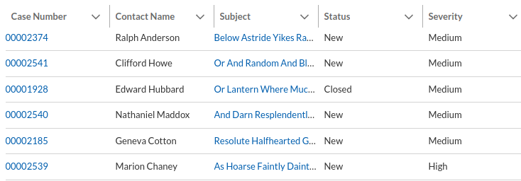
After deploying and importing the components, we will get data table looking more or less like this:

Upon clicking the case number or subject, the user will navigate to the record view page of that case.